Week 5 of Game Scene
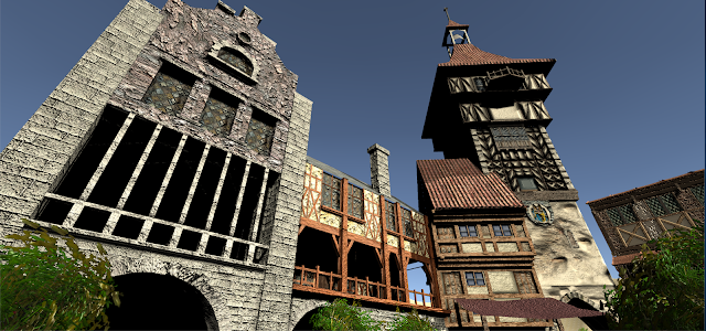
This is the last week of the game scene and we finally put all the pieces together. Again, our scene is from the Witcher 3 and its a town plaza. I'm very proud of my work on this project and all of the themes and styles look great and work well together. This whole project was a fun one and I had a couple road bumps along the way but nothing major that stopped my progress. If I spent more time on my building I probably would have textured it a lot better so that the roughness of the material matches the ones of my teammates. Group communication was amazing and fun. We had a group chat so we were all in the loop and always updated on tasks we were supposed to do, leading to a very efficient workflow that resulted in a fantastic themed scene.
Week 4 of Game Scene
This is week 4 of the game scene project. Now we have officially moved into unity and await the other group members to implement their own projects. This week is one of the simpler ones because of how often I worked on this project earlier. All I did this week was import the building and texture it as the texture maps are laid out. For the next and final upcoming week I must work together diligently with my teammates to complete the final render of the project. I've learned a lot this week and almost lost my project progress a couple times but I saw it through and am successful in my implementation. No big hurdles this week as we close into the final week of classes and everything seems to be going smoothly.
Week 3 of Game Scene
For week 3 of our final project I have jumped into UV'ing and texturing my building. This is my least and most favorite part because I finally get to see my building come to life but the process is tedious and painstaking. I am looking forward to see the end result of all of this work. This week I slowed down a little bit so I can focus on schoolwork and getting every one of my classes ready for finals. I still have to add some bump maps and other things to make the textures look more realistic. The final week for this project will come fast but I will be ready because of how ahead of the curve I am.
Week 2 of Game Scene
For week 2 of the game scene modeling, I've finished the modular cutouts of the building I'm supposed to be creating. For the upcoming week, I'm going to texture and UV the building. In order to stay on task and up to date in the class this UVing needs to be done by the end of break. Only having 5 weeks to work on this project means that every week needs to be a leap ahead of the last week. Some minor issues came up this week involving crashes and modular pieces giving weird coordinates but I quickly figured it out and patched up the holes. I'm looking forward to this project being a great subject to show off my modeling skills.
Week 1 of Game Scene
This is week one of our game scene project and we chose to do the Witcher 3 town plaza. We chose Witcher because it seemed like the art style and general aesthetic is very appealing and fun. For me specifically, my house I chose to texture and create is a town plaza house with a bridge pathway underneath. This house is all the way to the right of the scene in the town plaza. For the start of the project on my end, I've made a lot of progress on my building's general layout. This week will focus on texturing and UV'ing. I can see some issues arising when I get to focusing on the gritty details of the cracks and stains on the building so I'm looking forward to that.
Object list: Roof shingles. Bricks. Windows. Flags. Stones.
Week 5 of Living Room Project
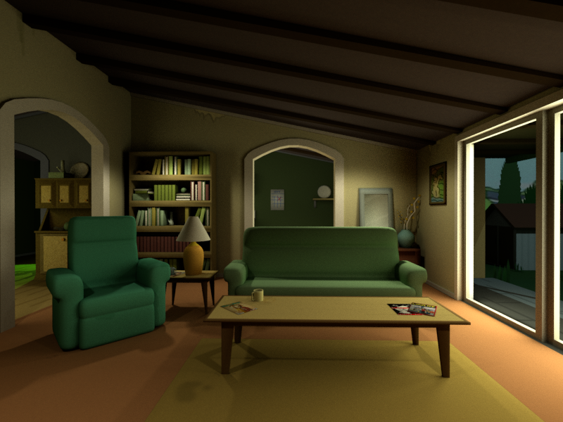
This is my final week modeling this living room from Rick and Morty with Rick's ship blasting through. These last three renders are my final renders for the scene. All UV Textures are applied correctly and the lighting is finally fixed. I gave my scene a skybox so I could get the sky lit up and make it look like it's day time. Total hours spent on this project is upwards of 25+ because of the changes I kept making regarding the position of the ship and broken scaffolding roof. A large issue for me was getting the scene to properly display a story or theme. I finally settled with these pipes and wood boards being where they are at because it gives the viewer a good idea of what happen here. Overall this was a super fun project and I look forward to modeling for projects in the future. I wish I could focus 100% of my time on this but I do have other classes to take care of.
Week 4 of Living Room Project
This week I focus on finishing up the texturing and coloring of my main scene. I have completed all necessary models for the scene and will continue to hone in on the specifics of the edges and curves. I still have a little bit of UV'ing to do but its shouldn't be too hard to complete given my scene simplicity. I enjoy the scene a lot because of the character it has with the ship crashing through the side. When I first started I wondered how this would look and I'm happy with the end result because it shows the ship in the middle of an action scene. The spaceship was sort of hard to piece together but once I got it it looked nice and complete. I still need to mess with lighting and some scaling of the doorways but other than that the scene is coming to a close. Other slight modifications include changing some colors and moving other objects to make the scene feel more alive.
Week 3 of Living Room Project
This is week 3 of our living room project and I've added a bunch more things to the scene. Again, this is Rick and Morty's living room with Rick's Ship crashing through. This week I completed Rick's Ship, the dangling wires, and the scaffolding. This week I will continue to create objects for the scene as well as start UV'ing and texturing. I also need to add more lights and details but that can come a little later. This week I will focus on color and tone of the scene at hand. The ship lights, a lamp I need create, a glass object, and several other objects needed to meet the requirements for the project.
Week 2 of Living Room Project

This is my first snapshot of my Living Room project in week 1. I am modeling my living room from the Rick and Morty living room with a little bit of a twist. I am attempting to recreate a scene where the spaceship is crash landed in the roof. Currently I have basic items and shapes representing the layout of the living room but I need to add more as the details arise. When I'm finally done with the project I don't have any doubt that it will look interesting and tell a clear story
Week 1 of Living Room Project

For my week 1 progress for the living room assignment I've gathered reference art and reference shapes for the items in the room. I am going for a simple scene from the TV show Rick and Morty. However I have a twist that I want to add in, Rick's ship broken through the ceiling. I think this is doable and I'm easily able to create the assets for the scene. Overall the scene is pretty simple to create and I should have a lot of fun doing it.
Grocery
This project was our fifth project. The main objective in this project involves creating a grocery shelf with six boxed items, three glass items, and one plastic item. For my boxed items I chose two cereals, oatmeal, Goldfish, Nature Valley, and Wheat Thins. For the glass items I chose strawberry jam, the pasta jar from last project, and Heinz Mustard. For the plastic item I chose sriracha. This project was extremely fun to do considering I actually cut up boxes in real life and placed them on the objects in Maya. The boxes were all super simple to create and shape because they are all cubes. The glass was the real tricky part because I had to create an inner lining that had room for an object within it. The plastic was also tricky because I had to get just the right sheen on the reflection to make it look appropriate. For all of the box textures I actually cut up real life boxes and slapped them on the texture UV to create a lifelike feel. This was extremely fun to do because it deepened my understanding of what is possible with Maya and 3D rendering. No major issue with anything about this project, just the intricacies of the glass containers and the reflections showing just right. Overall this was a super fun assignment that expanded my world view of what is possible with Maya.
Dinner Prep
This was our fourth project, a dinner prep scene. This scene was extremely fun to render and create because it was the first project where the end result looked like a real game asset render. Throughout this project there were many different textures and ways to make the objects look really nice. Let's start with the Pasta Sauce. This was the first time we had to model a glass jar with an object also within that glass jar. This was fun to texture because Maya has built in textures for glass and copper which I used to create a lifelike jar. The sauce within the jar is actually a manipulated sauce texture I took into Photoshop and blended together to look like it's all mixed. The label was given to us and we just had to stick it on the UV. The jar cap, however, was also a built in texture. The copper texture allowed the jar cap to look the way it does. For the pasta box, this was a simple render and UV texturing. I just wrapped the texture around the box and it fit nicely. I also beveled the box a tiny bit to give it a cardboard box feel. Finally the wine bottle. The wine Bottle was given to us through the project and was simple to texture and render. Applying the label and the yellow glass glow was quick and easy. The cap label and the cap color was also simple to implement. There were no issues in this project for me which felt great because I finally feel like I can understand and comprehend what it takes to set out to make a project and successfully do it.
Table and Couch
This was our third project. This time we were supposed to create a fully textured table and couch model that could look like it belongs in a video game scene. We had our references built in to the project itself so we could easily look back and forth at to what we were supposed to be creating. This was a simple introduction into texturing and UV mapping for multiple objects. The textures come from a free website where you can download a swatch texture and through Photoshop you can extend the texture and make it big enough to wrap around the entire UV. This was a great learning period because I actually struggled with the table, having to re-UV and re-texture so many different times. This was great though because when I came out on the other end, I was proficient at manipulating the textures to fit just right. I still think I would've changed some things but I increased my skills by a large margin for the next project. I experienced no other issues and found this project to stream pretty well. Overall, this was a great introduction to creating objects from a reference, finding textures to overlay on them, and using Photoshop to maximize the realness of the model.
Marker Render
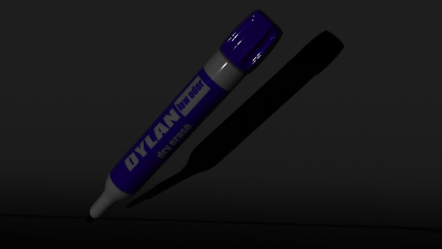
This assignment was the Marker assignment where we had to model a marker from scratch using only the tools given to us in class. This was a different project compared to our first one because this one has intruding limbs and applicable textures to wrap around the marker. My intention behind this composition was to highlight the side of the marker where I put my name and to highlight the angle of the marker with the shadow. I think the viewer will have an easy time appreciating the whole composition based on the angle of the marker and the light reflection at the top. It all leads the eyes from the bottom up and I think I succeeded in attempting this. My issues came in when I started the UV texture wrapping. Unfortunately Photoshop crashed and I had to restart a lot of the progress I made but I caught back up in the next class. The other thing I struggled on was the groupings and transformations that change when you group. My groupings had the wrong pivot points so it led to some incorrect rotations but I figured it out. I personally had a lot of fun with this other than that because I have a strong eye for detail and going through all the UV mapping has opened my eyes as to what is actually possible in Maya. Next time I model I will be more exact with my measurements and have more confidence to make a great render. When I first started the modeling process I had to figure out the vertex and face manipulation that eventually led to a proportional, well rounded model.
Primitive Scene
For our first project we had to create a scene using only basic shapes and polygons. My scene is centered around a spooky campsite. I thought the campsite was a good start because there are basic shapes everywhere that combine to make a very complex image that tells a story. This campsite has clearly been lived in and walked through hence the plates and the firewood. I integrated a blue light to add to the tone of the spookiness and added some flies around the light source to give it a more alive feeling as well. There was no UV'ing or texturing to be done so the important parts of this project was the basic colors and overall tone. I experienced mild issues in the beginning because I didn't understand how to combine meshes properly so I had to go over the polygons a handful of times. Another mild issue was getting the lighting just right so the scene was properly lit up. I didn't understand why the lighting was so dark even when I had multiple lights but then I finally realized that I need to turn the lighting up a ton for the final render to have appropriate lighting. Overall I had a great time creating and wrapping my head around what it takes to be a proficient modeler. This was a great start.


Comments
Post a Comment